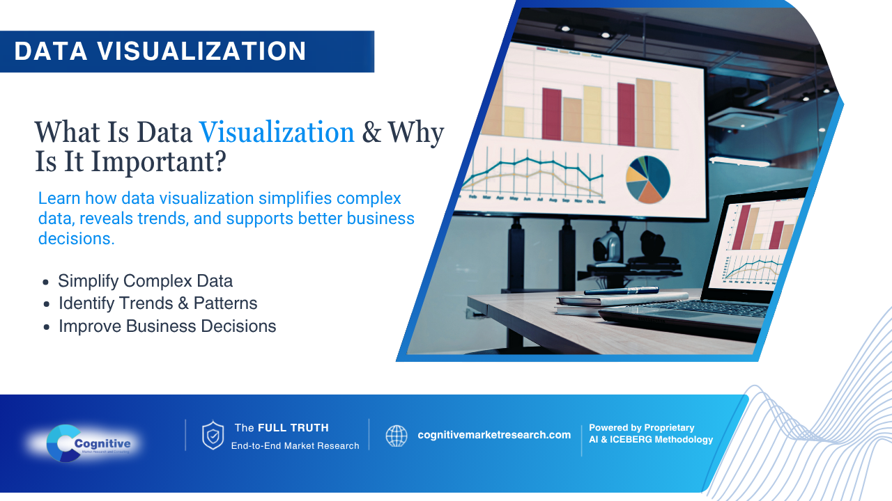
Blog Content
What is Data Visualization and Why Is It Important for Modern Manufacturers?
Picture this: You are a manufacturing executive or commercial leader who has just received a 300-page spreadsheet detailing global supply chain metrics, regional inventory delays, and consumer purchasing shifts. Instead of a clear path forward, you are met with an intimidating wall of numbers.
When critical capital decisions rely on raw data sheets, businesses risk falling victim to interpretation errors and expensive delays. This is where the core question arises: what is data visualization and why is it important for modern enterprises?
Simply put, data visualization is the graphical representation of information transforming complex spreadsheets into intuitive charts, graphs, and dynamic dashboards that allow teams to see patterns instantly.
Key Takeaways:
Definition: Converting raw metrics into visual formats like heatmaps, graphs, and dashboards to make patterns instantly recognizable.
The Core Benefits: Accelerates decision-making speeds, bridges cross-departmental communication, and exposes hidden market anomalies.
The Strategic Solution: True enterprise clarity happens when visual analytics are combined with expert frameworks from Cognitive Market Research and Consulting.
What is Data Visualization? Defining the Core Concept
Before looking at how to apply visual tools, we must define the mechanism. What is data visualization and why is it important in everyday operations?
Data visualization bridges the gap between raw quantitative information and human cognition. Rather than forcing analysts to manually cross-reference rows of figures, visualization software translates metrics into visual stories.
- The Primary Focus: Highlighting correlations, trends, outliers, and density shifts across large data repositories.
- Common Formats: Interactive executive dashboards, geographical heatmaps, trend line graphs, and process flow diagrams.
- The Enterprise Benefit: It aligns technical analytics with non-technical stakeholders, ensuring everyone reads from the exact same playbook.
Why Data visualization is Important? Critical Benefits you Must Know
Understanding the importance of data visualization goes far beyond making corporate slide decks look polished. For manufacturers, supply chain managers, and brand leaders, visual clarity translates directly to saved capital and optimized output.
Accelerating Decision-Making Speed
Traditional reporting cycles can stall operations while teams debate raw figures. Organizations that implement effective visual dashboards experience up to a 28% increase in decision-making speed, removing friction from executive choices.
Spotting Operational Bottlenecks and Market Trends
Numbers in a standard table can easily hide seasonal demand shifts or assembly line friction. Visual line tracking and performance meters expose operational bottlenecks immediately, allowing manufacturers to pivot before inventory becomes obsolete.
Enhancing Cross-Functional Alignment
When data is presented visually, engineering, marketing, and executive leadership can collaborate seamlessly. Complex metrics become universally understandable, minimizing departmental silos and misinterpretations.
Industry Tool Spotlight: How Microsoft Power BI Drives Visual Clarity
To build robust visual architectures, many organizations and data analysts rely on industry-standard platforms like Microsoft Power BI. As a leading business intelligence and data visualization software, Power BI helps enterprise teams connect to various data sources, transforming raw, messy tables into interactive, real-time dashboards without requiring heavy coding.
While tools like Power BI excel at rendering visual charts, they primarily display what is happening on the surface. To truly de-risk investments, forward-thinking enterprises pair these visual tools with the deep advisory insights of Cognitive Market Research and Consulting.
Instead of relying on isolated charts, Cognitive Market Research and Consulting integrates advanced data visualization directly into its proprietary platform, Athenaeum AI, combining real-time behavioral sentiment metrics, macro-economic indicators, and custom visual dashboards to ensure leadership teams do not just see data, they understand the human intent driving it.
Whether you are a global manufacturer mapping regional distribution blockages or a marketer launching a new product line, Cognitive Market Research and Consulting transforms cluttered data streams into clear, actionable visual roadmaps.
How Cognitive Market Research and Consulting Elevates Data Visuals
Raw visual dashboards only show what is happening on the surface. To truly de-risk investments, forward-thinking enterprises partner with Cognitive Market Research and Consulting.
Instead of relying on isolated charts, Cognitive Market Research and Consulting integrates advanced data visualization with proprietary multi-vector methodologies. By blending real-time behavioral sentiment metrics, macro-economic indicators, and custom visual dashboards, Cognitive Market Research and Consulting ensures that leadership teams do not just see data they understand the human intent driving it.
Whether you are a global manufacturer mapping regional distribution blockages or a marketer launching a new product line, Cognitive Market Research and Consulting transforms cluttered data streams into clear, actionable visual roadmaps.
Real-World Scenarios for Industrial Leaders
To see why the importance of data visualization matters, consider these everyday commercial applications:
For Industrial Manufacturers: A heavy equipment manufacturer tracks raw material deliveries across three continents. By utilizing an interactive geographic heat map, operations leaders instantly spot a regional supply bottleneck in Southeast Asia weeks before it halts factory assembly lines, allowing them to reroute shipments proactively.
For Commercial Marketers: An e-commerce brand reviews quarterly campaign performance. Instead of parsing numbers, a visual conversion funnel highlights a sudden drop-off at the shipping calculator stage, prompting immediate website optimization that recovers lost revenue.
Frequently Asked Questions
Can small businesses benefit from data visualization tools?
Absolutely. Even small teams can leverage basic visual charts to understand customer purchasing habits, track cash flow, and identify top-performing product lines without needing a dedicated data science department.
How does visualization prevent corporate bias?
By presenting metrics in an standardized visual format, stakeholders are forced to confront objective operational realities rather than relying on subjective gut feelings or confirmation bias.
Conclusion & Strategic Next Steps
Stop letting complex spreadsheets obscure your strategic vision. By recognizing what is data visualization and why is it important, your organization can turn messy data streams into absolute competitive confidence.
Ready to transform your analytics into clear, actionable intelligence? Contact Cognitive Market Research and Consulting today to discover how our specialized research frameworks and visual intelligence solutions can secure your brand's future.